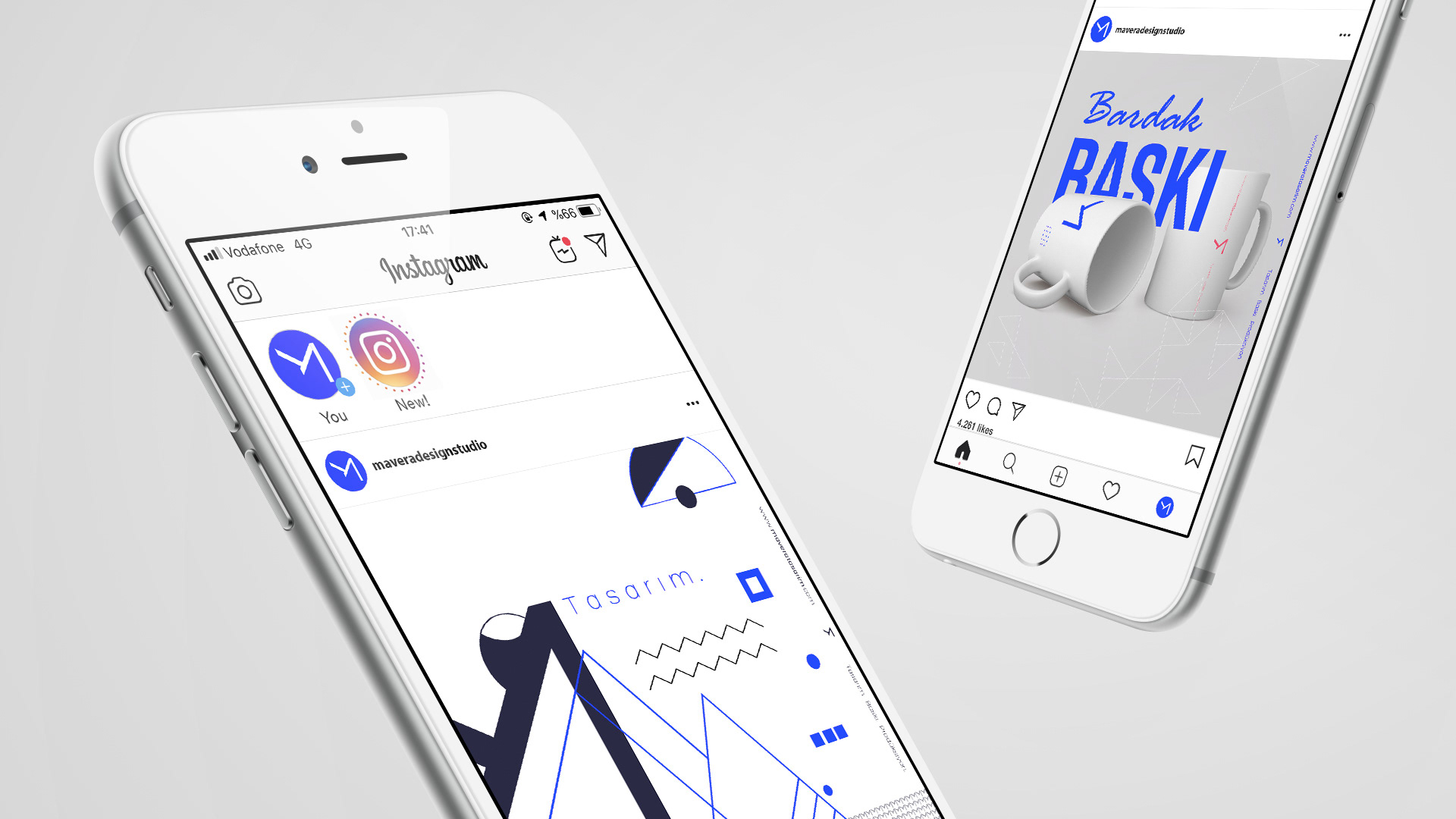
Mavera Design Studio
"MAVERA" means is beyond the realm.
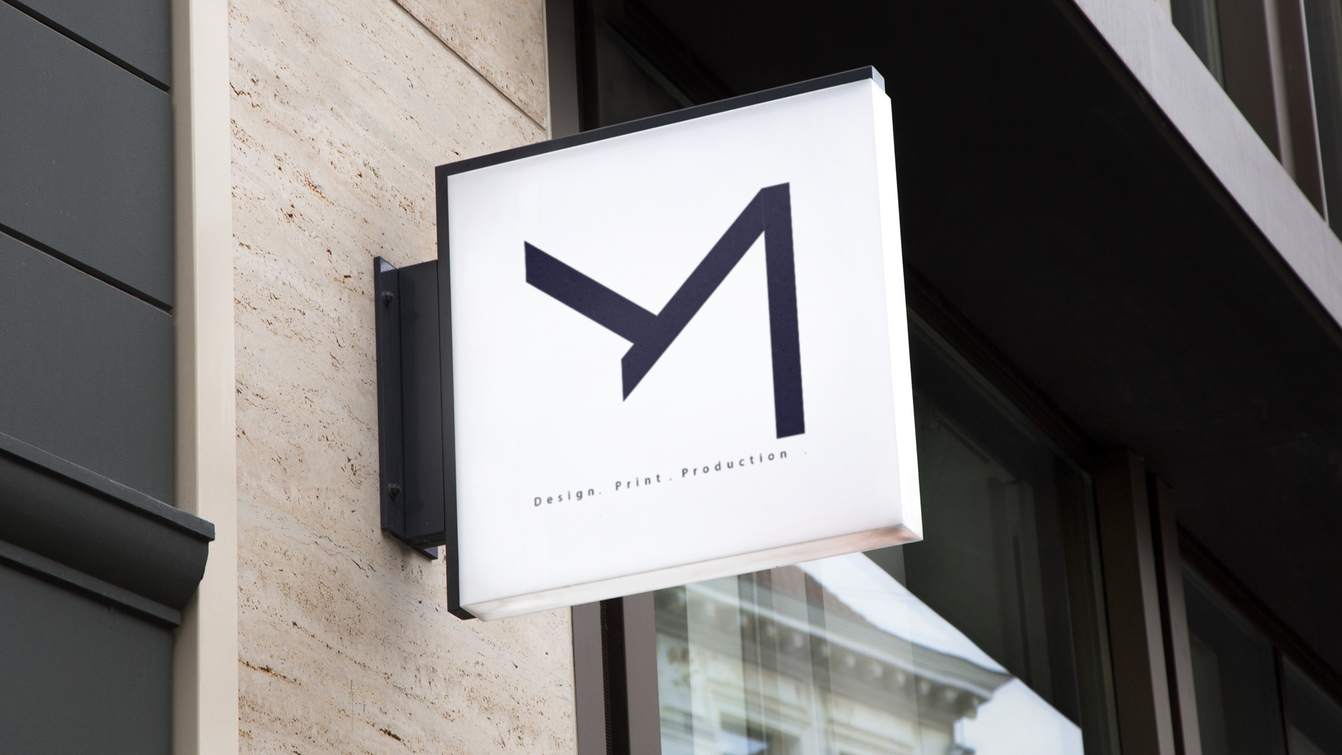
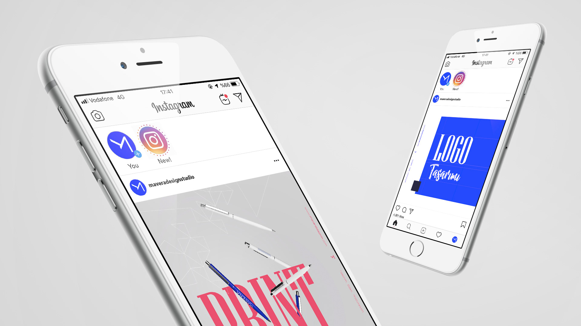
It is a company that provides design, printing and production services.
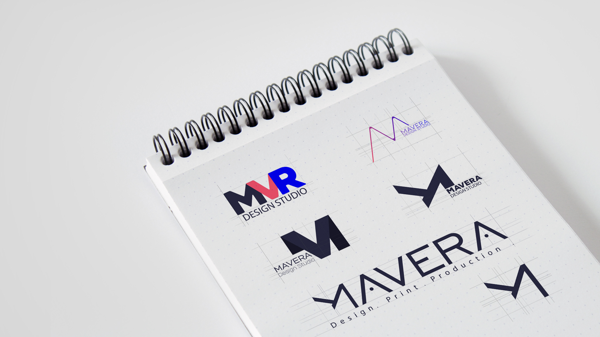
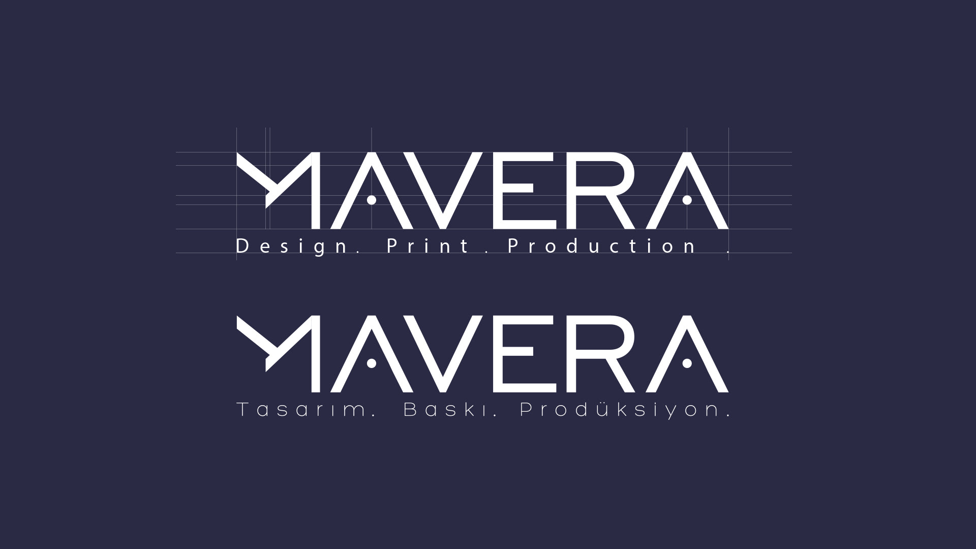
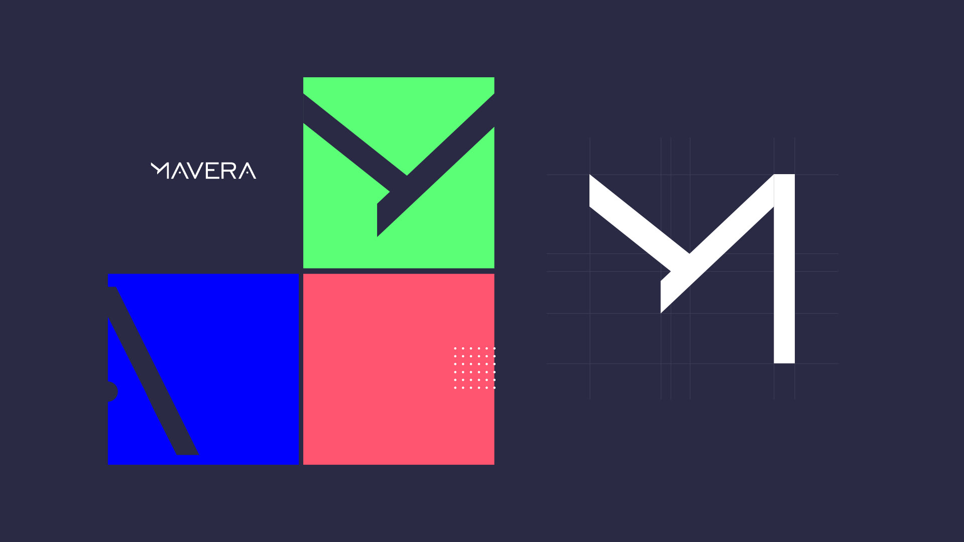
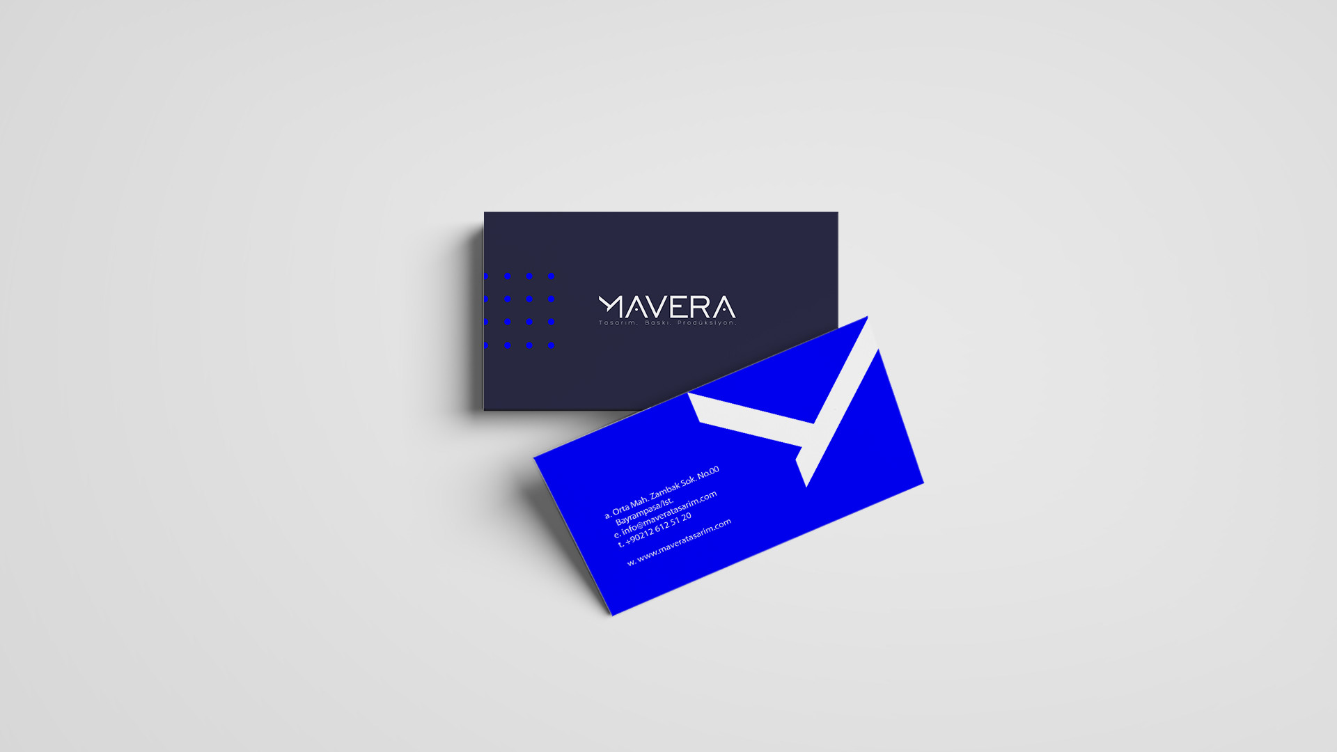
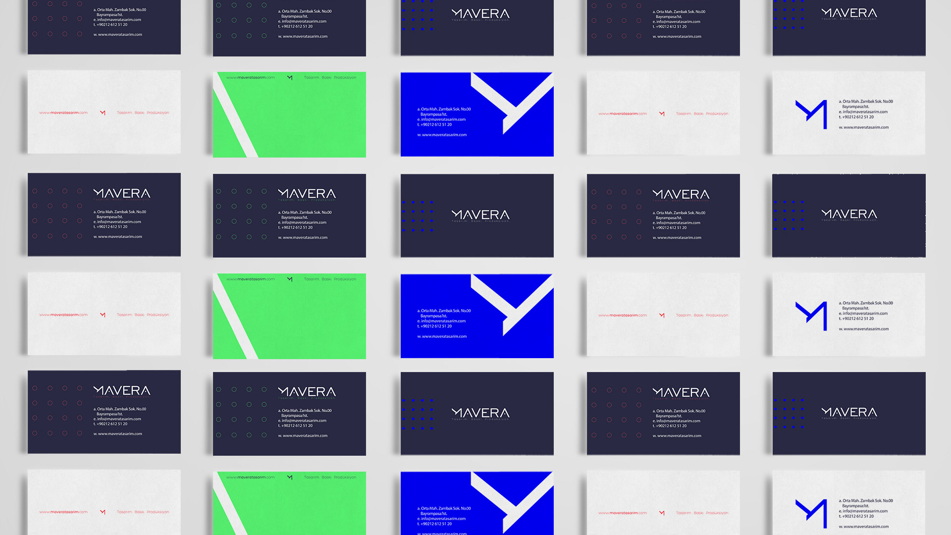
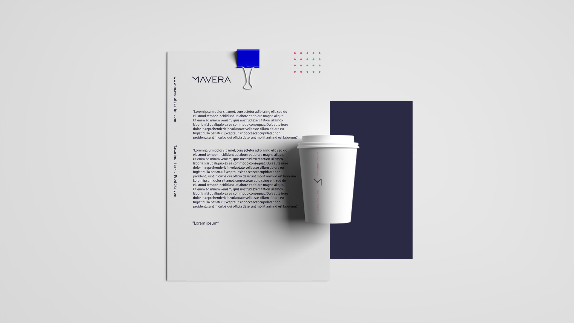
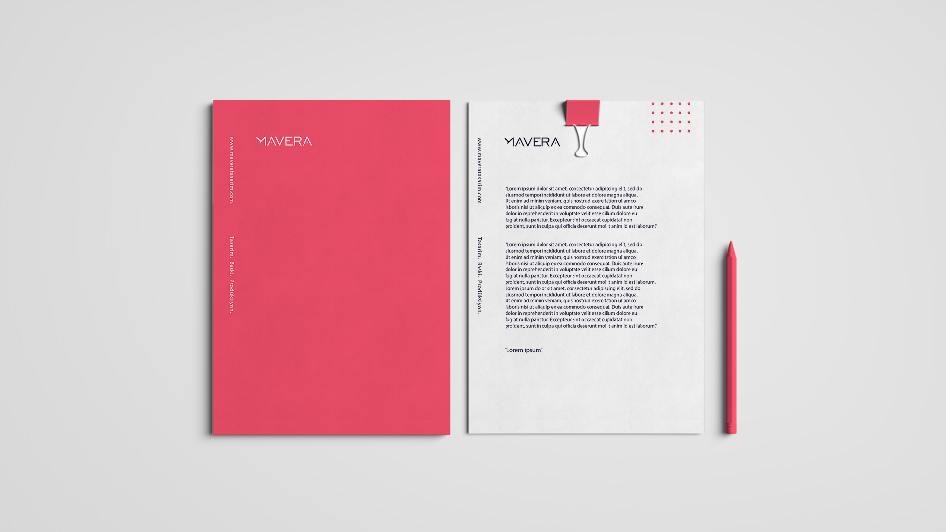
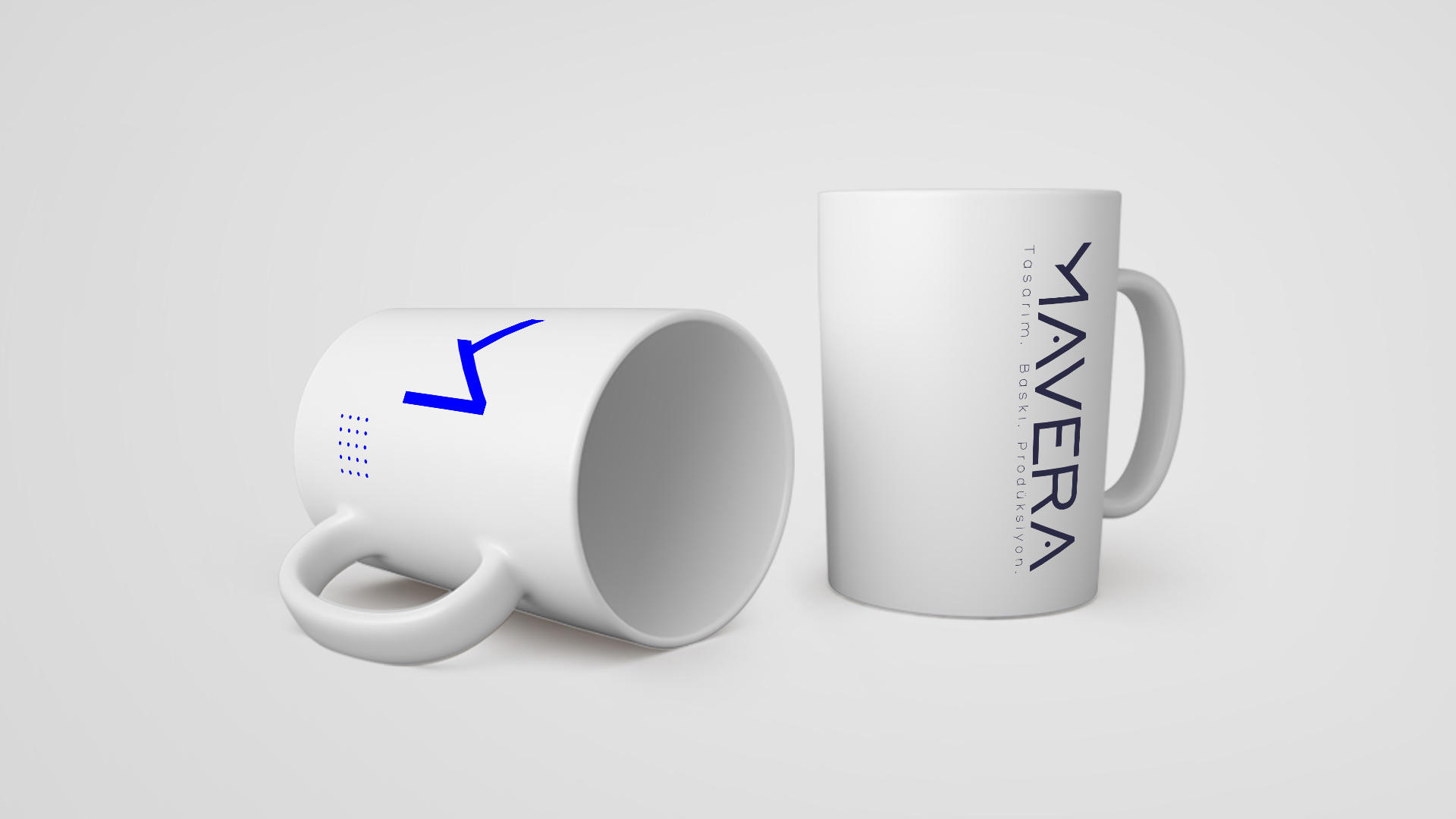
Brief was a strong and minimal identity design. I started with the letter M. The logo is available in 2 uses. One is the logotype and the other is the emblem.
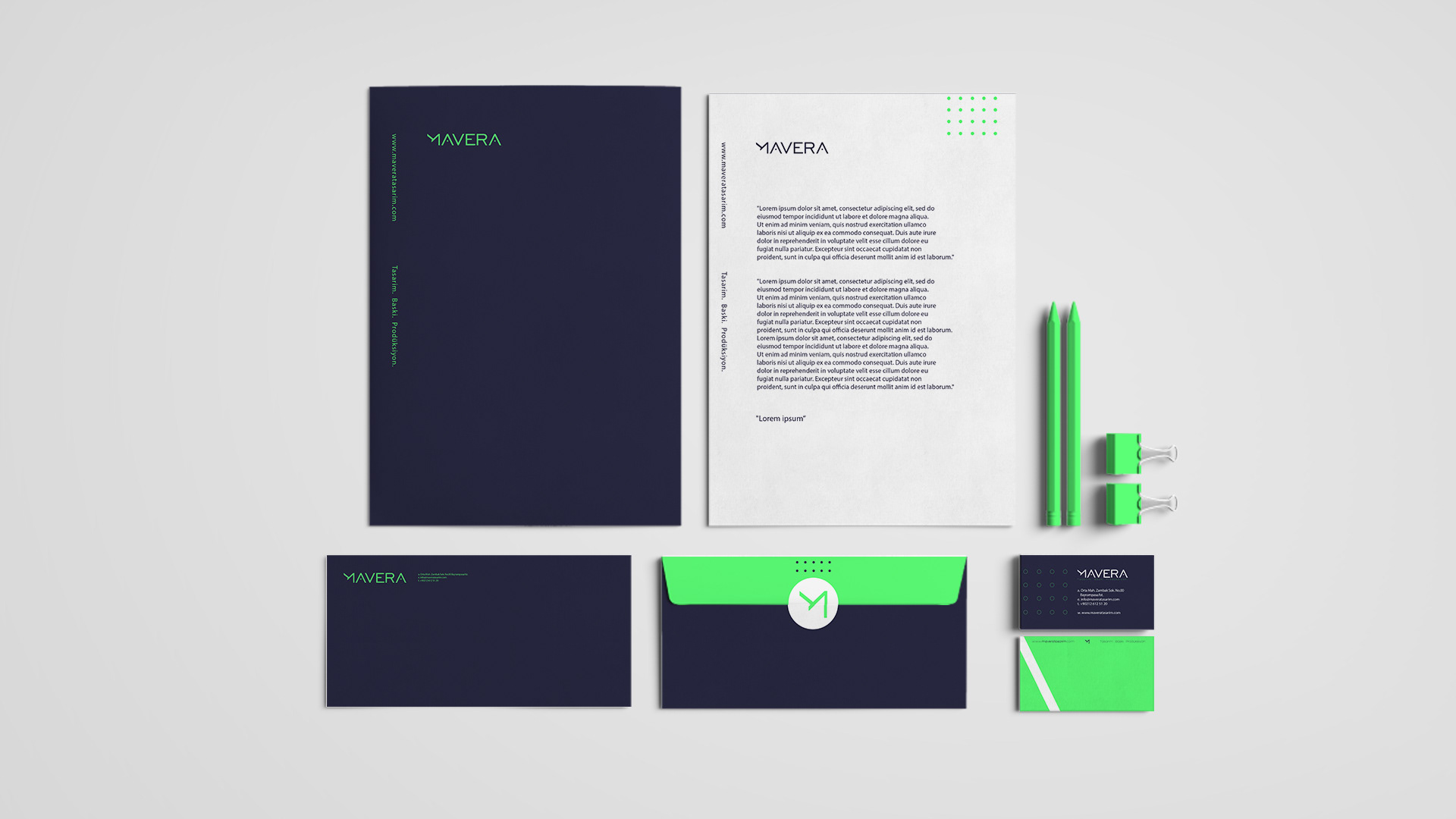
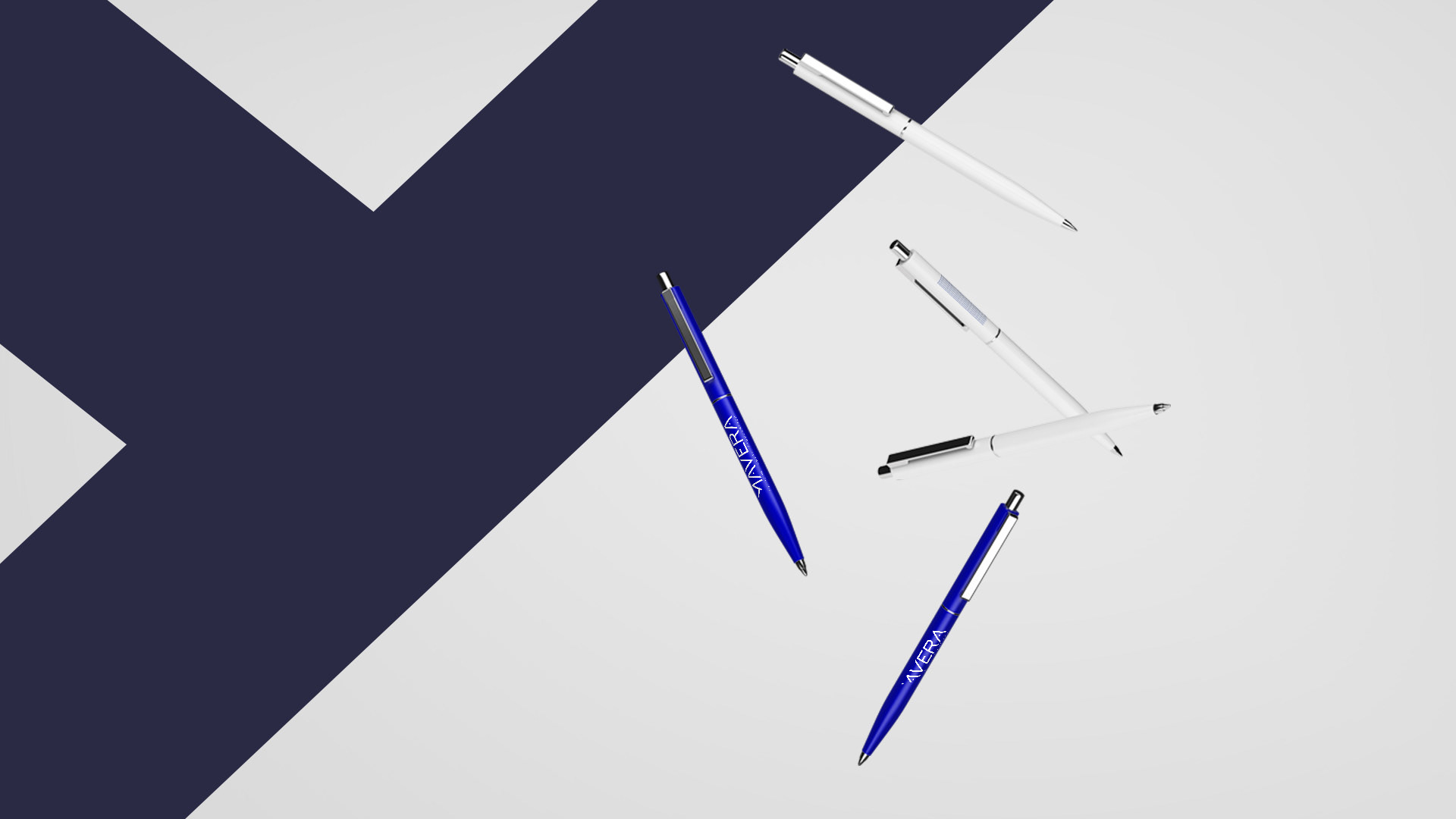
I chose 4 colors, one of which is the main color. Blue design, Pink print and Production is green. And I created a powerful and minimal design.
"MAVERA" Görülen Alemin Ötesi demektir.
Şirketin politikası Tasarım, Baskı ve Prodüksiyon hizmetlerini bir isim altında müşterilerine en iyi hizmeti vermektir. Kısaca Brief'im güçlü ve minimal bir kimlik tasarımıydı. Öncelikle M harfinden yola çıkarak logotype ve amblemini tasarladım. Yapılan tasarımlar arasından seçilenle de tüm kimliği inşa ettim. Bu paket hem kurumsal hem de dijital kimlik tasarımıdır. Biri ana renk olmak üzere 4 renk kullandım. Mavi tasarımı, Pembe baskıyı ve Yeşil prodüksiyonu temsil etmektedir.